ShopDreamUp AI ArtDreamUp
Deviation Actions


Suggested Deviants


Suggested Collections


You Might Like…


Featured in Groups


Description
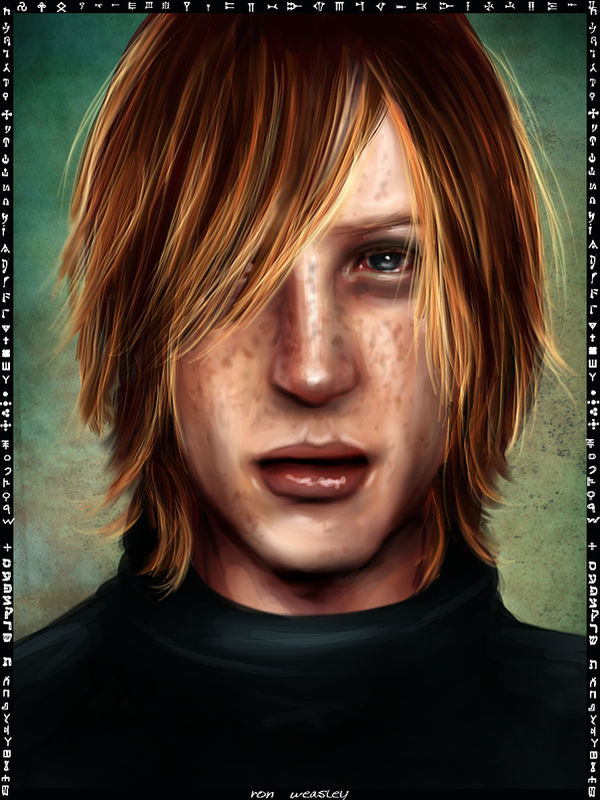
This was supposed to be Sirius Black.  I have to laugh, sorry.
 ") But he was too comfy as Padfoot, and too stuborn to change, so, you know.... Ron it is!!!
But he was too comfy as Padfoot, and too stuborn to change, so, you know.... Ron it is!!!  (Smile)")
You know the drill, blame Regulus...
______________________
JK's.
You know the drill, blame Regulus...
______________________
JK's.
Image size
900x1200px 1.6 MB
Comments29
Join the community to add your comment. Already a deviant? Log In
Hey! This actually really works for Ron...it makes an awesome Ron! I can see why it wasn't working as Sirius. Stubborn Blacks family! <img src="e.deviantart.net/emoticons/x/x…" width="15" height="15" alt="
Anyway I wanted this long because I wanted to do a critique, and had to wait until I was up to it.
So...first off--love the hair texture (as usual!) But you need to bring it up to the top. it just sort of fades into the base color up at the top, especially in the middle and right sides of the picture.
His nose and the shading around there look really good! The freckles look a little gray to me--just a little. I personally would put just a bit more brown into them. Good texture and placement on them, though!
The shading on the neck is very rough...it could use the same refining as you gave the face, especially that blob on the left side of the picture on the neck...the light colored one. Same with the shirt. The texture is okay, but it's really rough..a bit sloppy. Some refining would do wonders.
The eyes--gorgeous as usual...very realistic and striking. (I still wish I could do the eyes like you can!) One thing...at the top, beneath the upper lid, it almost looks like a band of...skin? Are those supposed to be lashes, or...? That doesn't look quite right.
One more thing...the corners of the mouth...especially on the right side of the picture...looks like you gave it a swipe with a lighter colored brush, and didn't refine it. It looks like the lips are painted over with a lighter color, and need to be furhter shaped and detailed.
I like how it's a bit lighter in color...a lot of the drker ones are good for mood, but a lot of detail is obscured, and the shadows look too dark or gray or flat. you've got great lighting and shading on this one.
Awesome picture...keep it up!